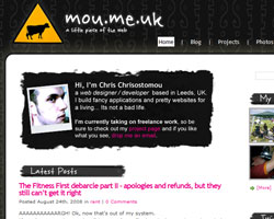
 mou.me.uk v3 was a collection of all the ideas I would have added into v2 had it not involved rewriting the entire theme anyway. So, I took the opportunity to start from scratch so I could tweak the design a little in the process.
The main change was the structure of the template to allow a big, white canvass to play with. This allows me to drop the sidebars and content sections and create a “full screen” type page easily if required.
The homepage itself was the biggest change. Historically, this had been like a traditional blog homepage – latest 5 posts, standard sidebar, etc. The new design takes the focus away from just the blog, and instead aggregates 4 sources that are integral to what makes my presence online – my blog, my photos, my twitter and my web projects.
The homepage also uses ajax to quickly skip through the blog posts and, as all ajax scripts should, dies gracefully if JS is switched off. Ajax search and a brand spanking new custom made photo gallery have been pencilled in for v3.1.
As well as this, the DB was flattened and recreated from scratch. As a result, Ive noted a massive speed increase.