 I designed my old website theme nearly 16 months ago, and its served me well. It was my first attempt at a WordPress theme design, and my first personal project since declaring myself to be a serious web “designer”, in addition to my day job as a developer.
I loved it, but it was time for a change. For one thing I have an itchy trigger finger, and I was screaming out to showcase some of the design/seo/usability tricks Ive picked up over the past 2 years (credit in part to the Web Design & Development forum I help moderate). But the main reason was the speed … looking at the plugins I was using, plus the work I’d done myself on the site, I was including 3 separate JS frameworks on every page load, 3-4 stylesheets (depending on the page), etc etc, all from the same domain. I had some reports of waiting 30 seconds for the page to load.
So my first task was to choose a framework and run with it – so from now, all my JS dev work will be on jQuery! Next was to split some of the content images and JS away from HTML and CSS in terms of the domain it was being served from to hopefully lower the loading time a little. I’ll see how this pans out, and if its a benefit I’ll work through and move some of my older images.
The design… well, that was a lot more difficult. Like I said, I loved my old design so I didn’t want anything radically different, but it was limiting in its current state… I designed it to accommodate 800×600 screens easily, so the actual content area was tiny. So for v3, I decided that while I would still design the content area to fit in 800×600, anyone still using such an ancient screen resolution will need to scroll a little to get it in view… this allowed me to stretch the container boundaries a little further out, giving me a lot more space to work with. Nice.
My other main concern was the plugin execution speed, which seemed to be adding a few seconds onto the execution time. I fixed that by dropped a few plugins and stripping a few others down and integrating them directly into my theme, which seems to have made a world of difference.
The inspiration… lol… actually came from a Government form, although right now exactly which one escapes me… if I remember I’ll add a photo of it here. But the key was that the back page of the form was just a big box, with the words “Write any further comments in the box below”. From that I got the idea of a huge blank canvas to work with – something where if I wanted I could just have a big whitespace to put content on. Remove the sidebars, add an extra, whatever. So I decided to move the logo, menu etc outside of the “canvas” area and give it more of a solid look. It may not make much sense now, but, for example, I’m working on a flickr photo album that looks brilliant when its spanned across the entire white box… they’re the sort of projects where I’m hoping it’ll pay off.
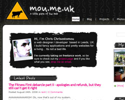
So to anyone who stumbles by, hope you enjoy the new look. And if you come across any bugs – let me know! 🙂
Now, off to fix some IE issues and work out what I did to break the ajax comments… :/
Well I think it looks cool. Oh yeah and I joined the Web Design & Development forum too however my subscription to this group is still pending. Would someone open the door and let me in, it’s really cold out here!
Cheers Dave!
Yeah, I think I must have accepted your request without noticing the email address… bloody hell, now who’s following who?? 😉